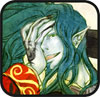
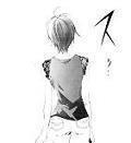
My problem with the cover is that it looks like Oh! Great just took some unused piece of Air Gear art, modified the hairstyle to make it Aya, and then passed the thing on to an assistant to colour using Microsoft Paint 3 hours before the submission deadline or something. Compared with the colours of vol 15, the dynamism of vol 6, and the composition of vol 8, this piece falls flat on all counts. I guess sensei just spent too much time on the Soichirou cover for the new UJ.
"Swallow your food whole, fool! Do you not know that mastication makes you go blind?"
wow, this was a serious let down.........as much hype as it was getting from the adverts (1,000 copies!), i was hoping that we'd get an awesome souichirou cover with his new look.........i think this one and vol 7 are the worst covers. meh~
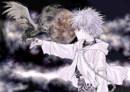
In this month's Ultra Jump there was an alternate TJTG16 cover. It is much nicer, in subdued shades of brown, of a named Madoka (I think.)
This weekend I'll take a picture of it (no scanner) and announce a contest where I'll give it away to whoever can help me update Character pages and chapter summaries.
I've just been crazy busy (48 hours of work from Friday to Monday morning) this week, so I haven't had time to do anything outside of work.
Mr. Prophet, yes that is the cover that I have. I like it a lot better than the official cover. I wasn't sure who it was - I'm pretty bad at putting names to faces.
Well, it does seem that TJTG is second to Air Gear as far as Oh! Great's manga priorities are concerned—which is sort of a disappointment in my opinion.
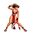
I'm just curious. (This is more of a question to Air Gear readers.) How is the graphic quality of that manga going recently?
Has anyone else noticed on the inside of the front covers from at least volume 12 (I haven't bothered checking any before that) it states in english "cover design; kobayashi mitsuru (geni a loide)"